Independent Project
Concept
These images are the a selection taken from three days of lunchtime wanderings around Lincoln. As a small city, Lincoln gives way quickly from the historic centre and high street to small commercial and industrial estates which sit unusually close to residential areas. In my time living in the city there has been a snowballing of expansion, leaving areas which previously made up the edges of the city ‘landlocked’ as further fill in housing and development expanded beyond what was the former boundary areas. This results in a strange clash of city zoning which to me speaks of the rather diffuse identity of Lincoln as a place trading on its history while doing the best it can to be steered towards a modernity that it’s relative isolation could be considered to have repressed up until recently.
These images represent my own ambivalence towards the place I have lived and worked in and around for the past seventeen years, a place during which I’ve never managed to become comfortable with enough to call home. This begs the question of what ‘home’ represents to the individual if it is not based on duration or current location.
Influences


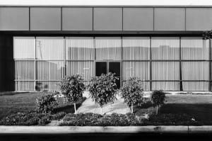
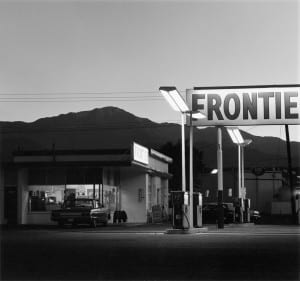
Images above: http://galleryluisotti.com/artists/lewis-baltz/images/
The primary influence on this piece is the work of American Photographer, Lewis Baltz and his ‘objective’ approach to place and space in Southern California. Baltz is closely linked to the now canonical ‘New Topographics’ exhibition. Baltz’s images stand in opposition to prior representations of location of aestheticised romatic landscape, although actually, they are ideologically aligned. Where photographers such as Ansel Adams chose to represent what they saw as a raw, pristine wilderness, Baltz and contemporaries like Robert Adams chose to show the obfuscation of the landscape in the American West – covering it up (completely in the case of Baltz) to draw attention to what is lost through development and capitalist ideals of ‘Progress’. The aesthetic standpoint of Baltz is one that resonates with me, the use of formal straight edged geometry describes a purity of graphic vision which manages to take what is could be described as a ‘blandscape’ – the edgelands of cities and industrial estates and elevate it through selective framing and composition. This gives the images a duality (to my mind) – one of mourning the loss of what was while celebrating as best he can, the value of what ‘is’.
http://www.tate.org.uk/context-comment/video/tateshots-lewis-baltz

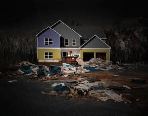
This is not a house (2008) a book and project by Portugese photographer Edgar Martins could be seen as a continuation of the spirit of employed by Baltz and Adam, exploring as it does the collapse of finance systems and modern archaeologies produced by sudden withdrawal of capital. Like Baltz and Adams, many of his images are shot in the American West and Midwest. One significant difference (use of colour aside) is Martin’s employment of ‘fictive’ elements within his photographs. He adds elements in post production, creates sculptural arrangements within the frame or brings in the occasional element of ‘magical realism’ by adding an incongruous bird to an otherwise ‘lifeless’ scene.

Martins describes the piece in his own words as follows…
The project sought to catalyse and reunite fresh experiences of a new form of American architecture by summoning a disquieting conjunction of realism and fiction. Employing both analogue and digital devices enabled me to enhance the paradoxical possibilities of the photographic image and to bring together irresolvable contradictions.
The houses depicted in this series do not refer just to the particular. They are images of spatial assemblages, of kinds of stages on which a number of quite different (and perhaps incompatible) narratives might be enacted.
This Is not a House emerges precisely at that juncture where clear words falter, where language is disturbed. It hurls us into the antinomies of perception and existence, the exploration of limits and unstable boundaries.
The Full series and above text can be found here: http://www.edgarmartins.com/work/this-is-not-a-house/
As much as anything, the images were probably influenced by the robotic, pervasive machine vision of Google street view, a tool I have used in various ways in the past, including ‘scouting out’ possible photographic locations.
Alternatives
Reflection
This brief was an opportunity to give thought to something that had never previously been at the forefront of my mind. I began producing the images as a matter of course, without specifically considering them in relation to the the themes of the assessment. Looking at them as a whole, there’s a sense of isolation that comes from the lack of obvious humanity within the frame (although as Baltz says in the video above, that’s not really true – of course) – it took a while for me to really take in how that visual approach might be coming from internal factors regarding my relationship with the city.
In terms of the images themselves, I tried to make my final selection based upon maintaining an essential ‘feel’ to them when viewed together while not going all the way towards creating a clear typology. I think the first four images in particular have a strongly connected visual relationship in terms of composition and visual elements, but this is eroded by the final two images. I’m in two minds about their inclusion, the image of balloons in particular (they were flying above a car dealership) I wanted to include them for the same reason I photographed them in the first place – they were incongruous and act as a kind of visual destabilisation. I’m still not sure that was the best choice of edit, they do take away from some of the negativity of images, I hadn’t set out to make something that had an air of misery about it, but it’s hard not to feel that when viewing them and perhaps the balloons alleviate that somewhat.
Approaching the work from a technical standpoint, I think they’re fine if unexceptional images, but I would have liked to have done more to get a more consistent tonality and kept the skies at the same exposure level to ensure a more fluent sequence.


Leave a comment